Wednesday, May 7, 2008
A Different Viewpoint: The SanDisk Sansa View
Posted by Doug Raeburn in "Digital Home Hardware & Accessories" @ 02:00 AM
Controls
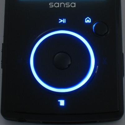
Figure 8: Backlit controls are functional and attractive.
The front of the View includes a mechanical jog wheel with an action button in the center, and a Home button to the top right. The operation of the jog wheel is similar to that of the control dial on most iPods, except that it actually moves as opposed to the iPod’s touch sensitive control. The View’s dial has very light detents that correspond with a single unit of menu movement. Spinning the wheel to the left moves up a menu and to the right, down a menu. The action button makes a menu selection. The jog wheel is highlighted with a blue ring when the screen backlight is on. Icons for functions such as play/pause, menu and home are illuminated as well.
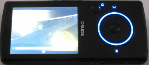
Figure 9: The View's controls automatically adjust for landscape use.
The View displays movies in landscape mode, which requires setting the player on its side. Sandisk has added a handy feature to go along with this… the jog wheel controls are reoriented along with the screen, and the illuminated menu/home, etc. icons are reoriented along with the wheel functions.
The jog wheel works very well, on a par with the iPod control after which it’s patterned. If you’re familiar with the jog wheel on the E200 series, the View is a big improvement. The E200 used a plastic jog ring with function buttons around the perimeter. The jog ring wasn’t particularly smooth and the function buttons were hard to press. With the View, on the other hand, the wheel turns smoothly and functions are easily accessed. Menu movement is responsive, but like with the iPod, it’s a bit too easy to overshoot your desired selection.
Overall quality is very good. The unit is solidly constructed and materials have a high end appearance. I compared the View to my 3G Nano and they seem to be of comparable quality.
Main and Music Menus
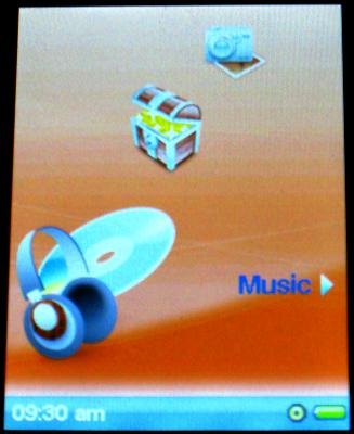
Figure 10: The main menu may lack flash, but it's functional.
The Sansa UI graphics are pretty much the same as with the E200 series. Which is to say, not bad, but they fall short of the sophistication of most of the iPods. A series of icons rotate through the screen. Each icon has a text description to the right, along with an arrow. The desired function is selected with the action button.
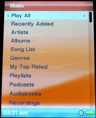
Figure 11: Lots of options on the Music menu.
The Music menu has all of the options that you’d probably expect. You can play all music, list by artists, albums, genres, etc. You can also choose podcasts and audiobooks that you’ve downloaded and recordings that you’ve made.
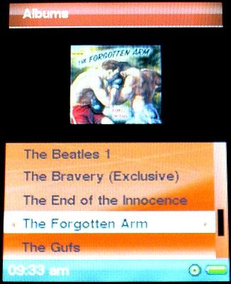
Figure 12: Sansa's answer to Cover Flow.
When listing by album, the View can be set to display album covers. This doesn’t have the showy feel of the much hyped Cover Flow on the Nano, but it works well enough, providing the same information with a bit less glitz.